I never planned to write this post.
The design is settled, the blog has been running for a while, and saying anything about it feels redundant.
But then someone asked me how I came up with it, and I found I couldn’t explain. It wasn’t something I sat down and invented one day. It grew bit by bit. Every step had a reason, but at the time I couldn’t have told you what that reason was. I only felt “yes” or “no.”
So I’ll try to write it down, tracing those “yes” moments backward and seeing how far I can follow them.
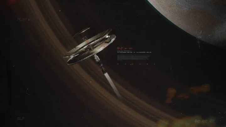
The starting point was the Lone Trail event in Arknights.
But I can’t point to a specific image that made me stop, because it wasn’t an image, and it wasn’t a character design. It was an atmosphere, something that filled the whole space once you entered the event. After thinking about it, the closest description I can find is: the feeling you get watching documentaries about the Apollo moon landings.
That comparison probably sounds grand, but I don’t mean grand narrative. The Apollo documentaries show you very concrete, very technical things. What they give you isn’t “wow, this technology is impressive,” but something deeper — a strong sense of the future. A person standing at some threshold, about to go somewhere no one has ever been. The feeling isn’t clear. You can’t explain its logic or its texture, but it’s real.
That’s what Lone Trail gave me.
Then I started paying attention to its UI design. The information density was controlled very precisely. It wasn’t imitating some sci-fi aesthetic; it was using a highly restrained visual language to tell a story about space and humanity’s future — and that feeling came back.
I started tracing backward to find where this feeling came from.
The first stop was NASA.
Specifically, the design language of the NASA worm-logo era, roughly the 1970s to the early 1990s. NASA had a remarkably complete visual identity system in those years: strict rules for type, color and layout, with internal documents following a fixed typographic language. You can still find huge numbers of scanned documents from that era on Archive.org or NASA’s technical report servers. They were never designed to be “pretty” — they were made for engineers and scientists, and the requirement was accurate, efficient communication.
But when you open those files, you get a strange feeling.
Their beauty doesn’t come from decoration. It comes from absolute functional honesty. Every element does the job it is supposed to do; nothing is superfluous. The numbering system exists for citation, the grid exists for alignment, the monospaced type exists because of the printing technology of the time, and the generous white space exists to rest the eyes and leave room for annotations. Not one of those decisions was made for aesthetic reasons, yet the result has a restrained, calm, almost cold beauty.
There’s one more thing: those documents were printed. Paper — beige or slightly yellowed paper, not a glowing screen. That texture, that weight, that feeling of writing notes on them (even though we can only see scans now) — the fact that “this is paper” seeps into the visual language and makes it fundamentally different from anything digitally native. It has weight. It is not a sheet of glass.
That directly influenced the background color of my blog’s article pages. I don’t use white; I use beige. Not for eye comfort or retro nostalgia, but because that color feels like paper. When you read on it, it feels like reading a document rather than staring at a glowing piece of glass.
Going further back, I arrived at Swiss International Style, also known as the International Typographic Style.
This was a graphic design system developed in Switzerland in the 1950s and 60s. Its core is the grid system, sans-serif type (most famously Helvetica), clear hierarchy of information, and a fundamental attitude: the purpose of design is to let the content be seen, not to let the design itself be seen.
Less is more comes from here. But the word “less” is easily misread as “simple” or “lazy.” Swiss International Style doesn’t mean that. It means something closer to “nothing superfluous.” Every element must be able to answer one question: why are you here? If it can’t answer, it shouldn’t exist.
There is something almost cruel in how cool this logic is. It does not accept “this looks better if I add it” or “this makes the page look less empty.” Those are not reasons. But that strictness also brings a particular kind of freedom: once you remove everything unnecessary, every remaining element carries weight and deserves attention.
From Swiss International Style to NASA’s document aesthetic to Lone Trail’s UI, I see the same logic evolving across different eras and different media. All of them trade restraint for clarity, subtraction for trust.
I’m not a graphic designer, and I’m not doing academic research. I was just tracing the source of a feeling, and when I got somewhere and felt it was enough, I started building. Then I ran pnpm dev, watched the page come alive, and thought: yes, this is the feeling. I really can’t explain it, but that’s exactly how it is.
Where “less is more” actually lands
I once wrote:
People who fill their blogs with gaudy effects and flying pop-ups have no respect for the word “content.” Anyone who sacrifices the reader’s reading experience just to play with digital building blocks — if even the basic need to read an article comfortably is compromised by a garbage underlying architecture — does not deserve to call themselves a blogger.
That wasn’t just an outburst.
I think about where a reader’s attention is when they open one of my posts. If it gets grabbed by a scrolling marquee banner, interrupted by a pop-up ad, or dragged away by some flashy irrelevant widget at the bottom, then I have already failed as an independent blogger — not because the writing is bad, but because I didn’t give the reader an environment where they can concentrate on reading.
The article page design starts from exactly that. Only the article. Nothing else is needed. Beige background, large enough type, generous line spacing, breathing room between paragraphs. No floating share buttons, no reading progress bar, nothing that jumps out while you’re reading. At the end there is author information, a copyright notice and related posts. But all of that appears after you finish reading. While you are still reading, I don’t want to interrupt you.
This logic also shapes the overall decorative density of the blog. You’ll see a lot of “technical document” language: CEPATO TECHNICAL NOTE, // END OF REPORT. Some people ask whether there’s a fictional worldbuilding behind it. My answer is blunt: no, it’s pure decoration. But the decoration itself is restrained. It sits in the corners of the page as a marker of visual hierarchy, never dominating. If you notice it, it’s fun. If you don’t, it doesn’t affect your reading. That is where decoration belongs.
All of this grew naturally out of the same person, and I don’t see any contradiction. The blog contains philosophical reflection, technical notes, diaries and personal thoughts. The shell is a cold, hard technical-document design; inside is very ordinary writing by a very ordinary person. Is that a problem? People are like that. I am like that. All of it comes from the same core.
Why a blog and not Weibo
I thought about this question for a long time. I’ve said before:
Time punishes everyone who doesn’t pay attention to recording things.
Today I want to add the second half:
Keeping your records somewhere unsafe is a lack of respect for yourself.
The first sentence is about the necessity of recording. The things you think don’t matter now will become the things you want to find in five years and can’t. Not every record is meaningful, but everything meaningful deserves to be recorded. Time will not preserve those precious moments for you. It will erase them.
The second sentence is about where you keep them. If all your writing lives on Weibo, WeChat public accounts, Zhihu or Xiaohongshu, those platforms can disappear at any moment, ban your account at any moment, turn what you wrote into a 404 at any moment. Your words are not yours. You are only storing them temporarily on someone else’s server. One day the platform shuts down, or the algorithm changes, or your account gets banned over some sensitive post, and you may lose everything you ever wrote.
This is not alarmism. It has already happened. It has happened to me in the past, and it will keep happening.
So I need a place of my own. An independent domain, my own website, full ownership of the data. What I write lives in my repo. I can export it, migrate it and decide its fate at any time. This is digital autonomy. It’s not a technical flex; it’s basic respect for my own writing.
The Essays page is an extension of the same logic. The things that aren’t worth a full article — a one-line thought, a screenshot, a small event — still deserve to be kept, but they don’t deserve to be fed to an algorithm on Weibo. Put them on my own blog, ordered by time, purely as a record. No traffic pressure, no expectation of shares, just so these things exist somewhere.
Coffee · Code · Night
My blog has three core keywords: Coffee, Code, Night.
I often write late at night. It’s quiet then, and my mind is clear — good for turning what I want to say into words. Many of my posts were written late at night, listening to lo-fi and drinking coffee.
I want readers to feel the same thing when they open this blog: some idle moment, make a cup of coffee, sit down, relax, and slowly read one article. That’s the best scene I can offer a reader, and it’s also my own favorite reading state.
The whole design serves that scene. Beige background, loose layout, no interruptions. It wants you to slow down here — not skim, not jump around, but actually sit down, relax and finish an article.
Under today’s short-video and algorithm bombardment, that is genuinely hard to achieve.
Finally: you know whose place this is
My name is buried in every page of the blog. Not a giant logo, not a reminder every three paragraphs that “this is Chongxi’s blog.” I just appear quietly in the author card, the about page, the distribution notice, the end of every article. After you finish a post, you won’t remember being told who wrote it, but you’ll know.
In business terms this would be called brand building, but I don’t think that far. I just feel that if you’ve had a good reading experience here, I’d like you to remember who this place belongs to. I don’t care about traffic (I run an independent blog, after all), and I’m not trying to monetize. It’s just a simple wish to be remembered.
This blog will never be finished. I use it, notice something feels wrong, change it, feel that it’s right again, and keep using it. It will always be like this — something that grows naturally out of me, changing along with me.